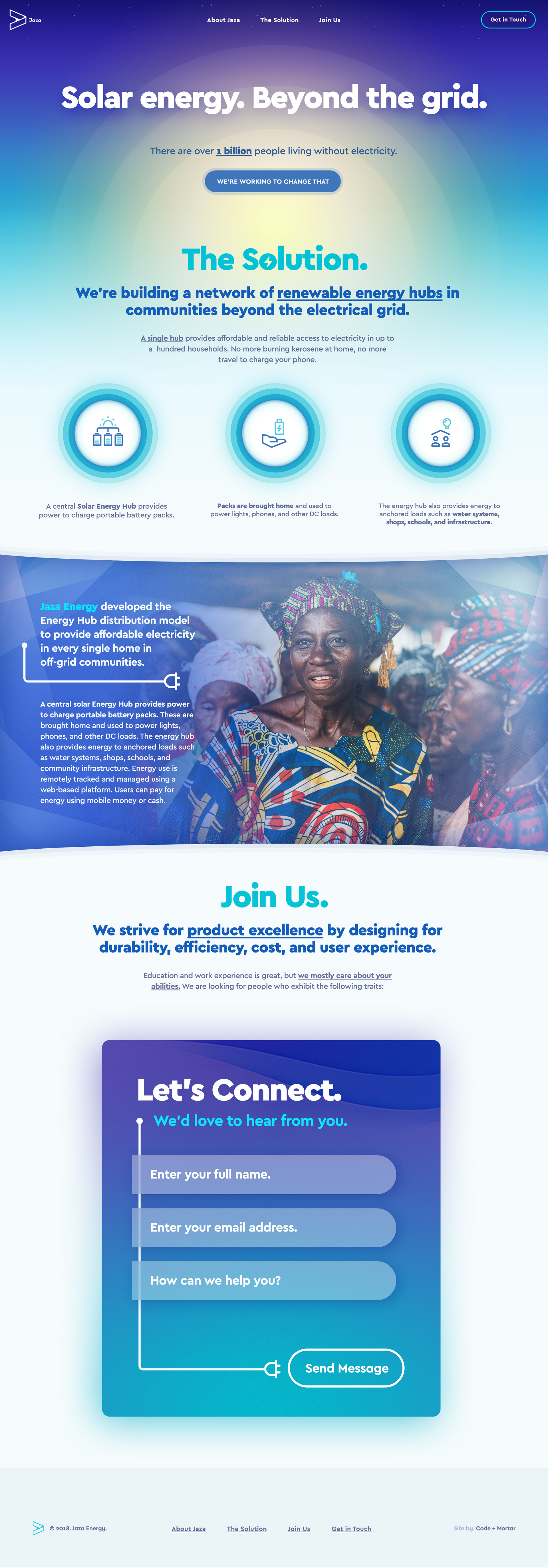
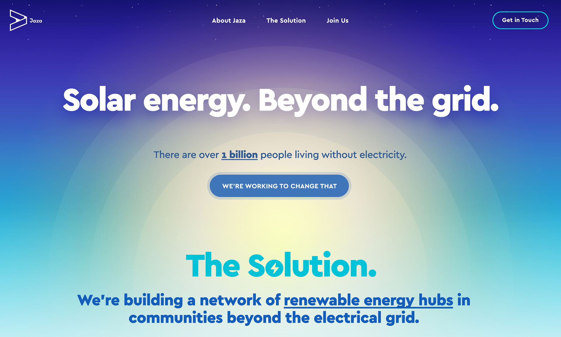
Communicating Scale
The Jaza Energy project came with a challenge; how do we adequately emphasize the scale and weight of such an initiative? The answer is in the energy source itself - the sun. We all recognize both the sun and the universe as being something much, much larger than us and the planet we call home. I decided to focus the header section on this concept by creating an artistic representation of the sun and the stars. Coupled with strong, bold typography, we're left with a striking composition that puts your focus directly on the subject matter.
Flow & Purpose
The goal of this project was to communicate the purpose of Jaza Energy's work and also explain the process behind the concept of the initiative. The entire site carries a natural harmony and flow that's built heavily around the initial header composition and brand colours. In order to further describe Jaza's goal and purpose, I've first introduced simplistic iconography and content blocks to demonstrate the process. Further, I've also introduced some familiar imagery to tie it back to the human element within Jaza.