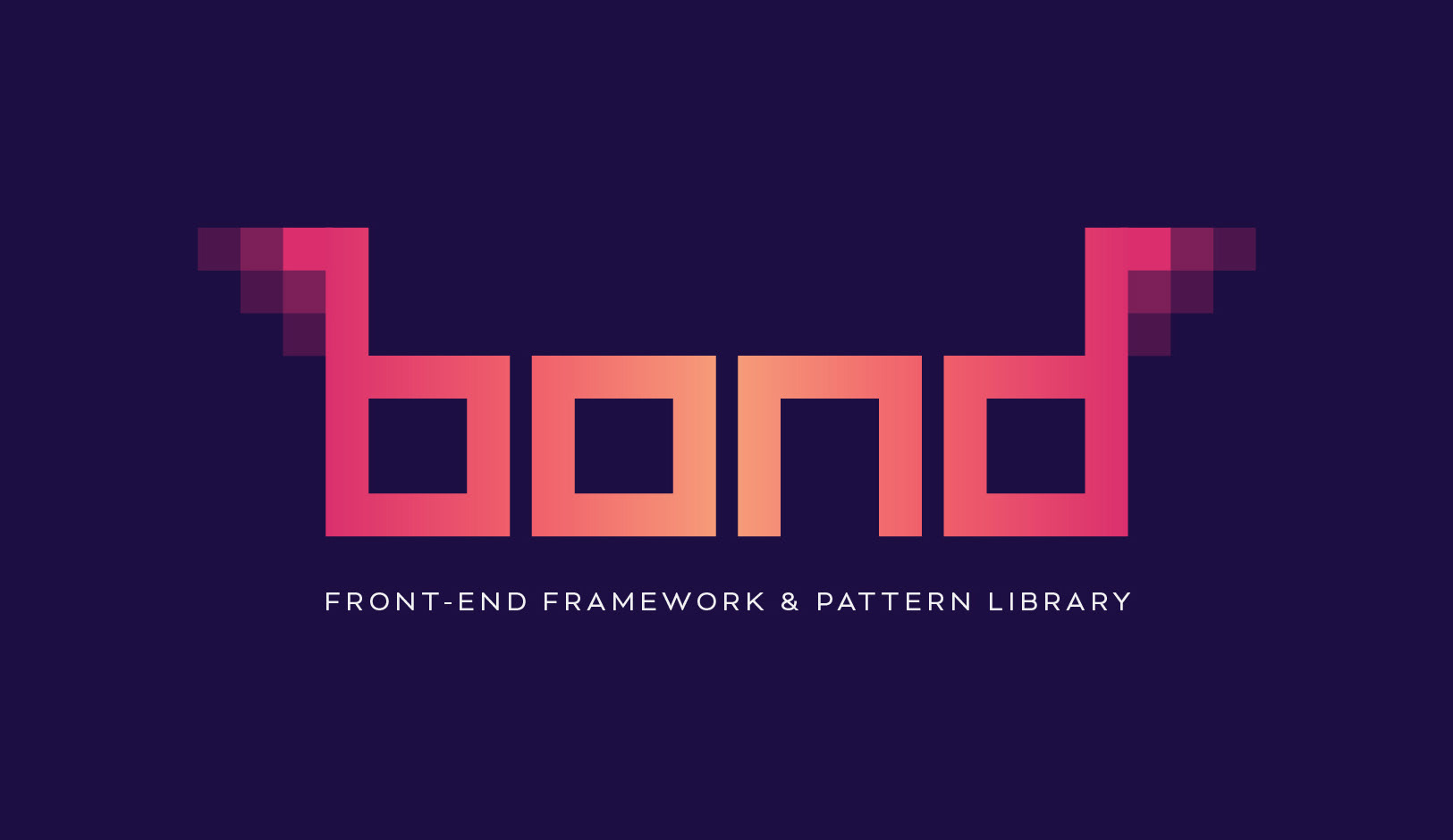
Bond's digital nature is communicated through a monospaced, geometric, retro look. The "pixel" blocks that bookend the logo create digital "wings" and help to promote the idea of speed. Sharp, vibrant tones are used to inspire urgency and excitement.
Identifying a Need
Working in front-end development for over 10 years, you start to notice some rudimentary patterns in the needs of your customers. For example, a website is always going to need a header and footer, so why not build them agnostically and customize as needed? And so, Bond was born. Granted, this is not a new concept and it is certainly the basic formula for the beginnings of any framework, but I wanted to build Bond specifically around Atomic Design and component libraries. I wanted a framework that was custom built for my specific needs as a front-end developer.
I began by creating a Trello board with a list of the most common components we have used in the projects we've built over the past 10 years. This helped to lay the groundwork for the primary organizational structure. From there, it was a matter of breaking these components down into even smaller pieces which could then be reused and implemented wherever they're needed; cross-platform, cross-component, cross-device. The complete picture of Bond's potential was beginning to come clear.
"But there are dozens of frameworks out there already..."
True, but you have to remember there is no single framework that's a one-size-fits-all solution for everyone; not even Bond! And accepting that as fact before my build process began was key. It helped me pare down features and focus directly on the core purpose of Bond which is rapid production.
Every developer works in their own unique way, influenced by years of production. These little quirks and techniques tend to find their way into frameworks which can cause minor frustration if they're drastically different than the way you work. I've used countless front-end frameworks through my years of production work, and have always found that they weren't quite what I needed or the inherent workflow they required was too far separated from my own. First and foremost, I built Bond for me. Bond proudly incorporates my own development quirks and techniques because it's how I work best and most efficiently. Bond helps me build digital products faster.
With that said, I still wanted Bond to be open-ended and accessible. And by using some familiar code structure, front-end techniques and thorough documentation, Bond was given the support it needed.
Atomic Design
Coined by Brad Frost, Atomic Design is a front-end methodology for creating design systems or "patterns." It encourages you to break down digital components into smaller, more digestible pieces. Each component has its own set of styles that feed into the overall design system. This ultimately creates a front-end environment that's easy to manage and edit, quick and simple to navigate, and a breeze to extend or future proof.
As part of a personal development exercise, I performed extensive research on the pros and cons of Atomic Design and created a slide deck detailing how it could be applied to our daily process.
Click the image above to download the Atomic Design Slide Deck (PDF)!
The Technology
Bond's foundation is made up of BEM-infused HTML, PostCSS, and jQuery. Each of these technologies was carefully chosen in order to achieve the ultimate goal for Bond: efficiency.
BEM (Block-Element-Modifier)
BEM is a front-end coding methodology that creates an environment more conducive to design patterns and components. HTML elements are classed descriptively and verbosely, components can be managed on an individual basis, and adding, modifying or removing components becomes easier and less destructive. This is particularly true for mid to large scale projects with many templates and design patterns.
I spearheaded implementing BEM company-wide in 2015. There is a definitive learning curve, but since being implemented, BEM has proven to be invaluable which is why I incorporated its methodologies into Bond.
PostCSS
PostCSS is a tool for interacting with CSS through the use of Javascript plug-ins. Not unlike SASS, it allows you to utilize features not available in vanilla CSS such as variables, nesting, mixins, color functions and more. Unlike SASS, however, PostCSS allows you to selectively pick and choose which features you require on a per-project basis, meaning the processing time is significantly faster and more streamlined.
Component Compendium
Bond has an extensive collection of components. As mentioned above, the following is a basic representation of some of the most common components and design patterns used in our projects.
• Header with custom logo and flexbox layout options.
• Footer with social icons, copyright information and quick links.
• Basic navigation with drop-downs and fly-outs.
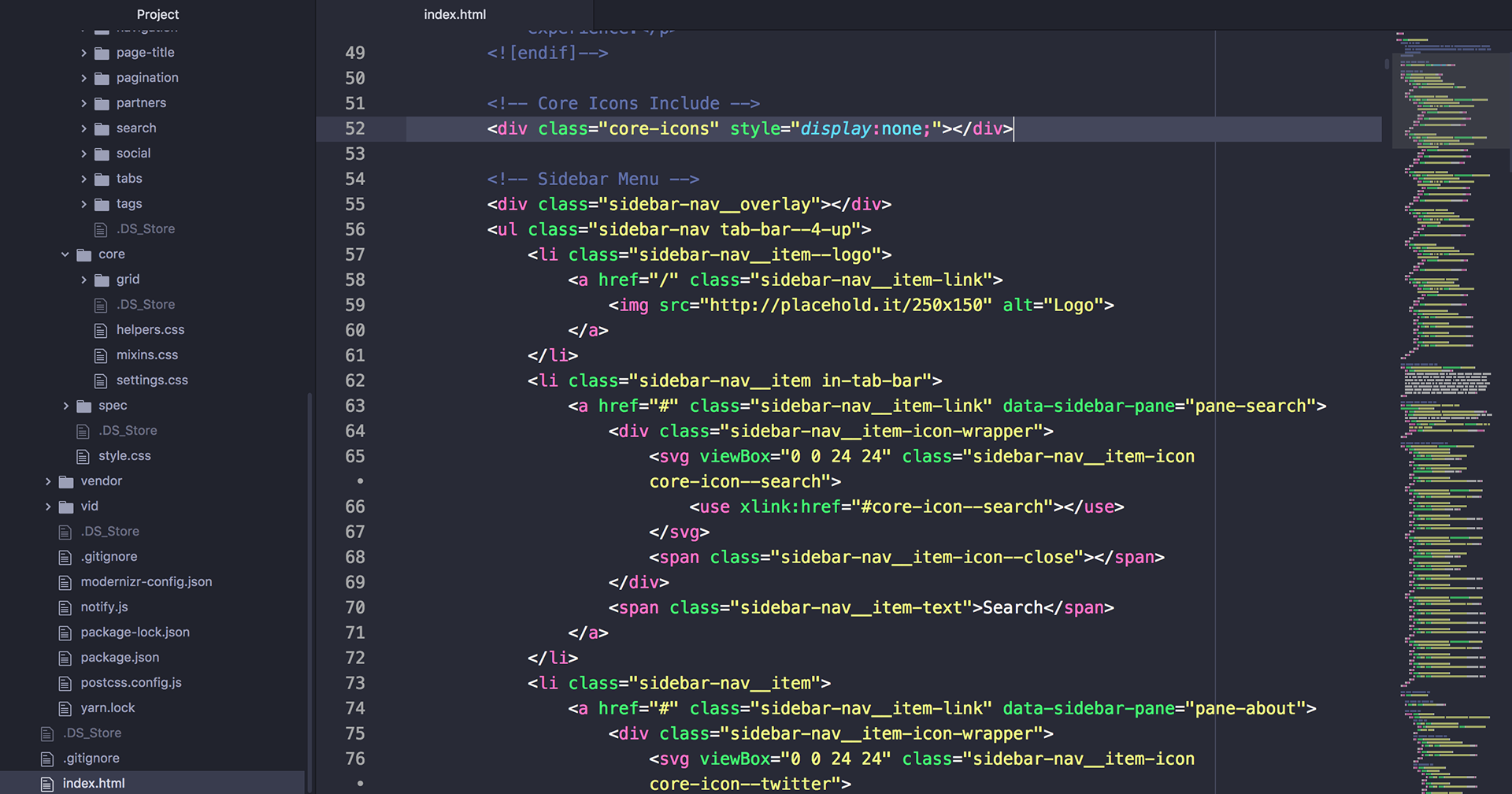
• Sidebar navigation with full-page panes and a mobile tab bar fallback (includes icon support).
• Accordions.
• Grid system based entirely on the flexbox layout model.
• Responsive tables.
• Automatic broken image fallback support.
• Multi-state alerts (danger, warning, success).
• Blocks and grids using the latest CSS grid syntax.
• Hero section with optional carousel and embedded video support.
• Complete form styling including validation and custom select elements.
• Dialog boxes and modal windows.
• Full-viewport photo gallery with keyboard support.
• Tabs with a built-in toggle system.
• Multilingual toggles.
• Buttons with multiple states and variants (outline, neutral, danger, small, etc.)
• Site-wide consistent padding and spacing.
• Custom search and search results layout.
• Pagination with options for "basic" and "lazy load" style.
• Social sharing options with automatic color coding based on the element's link attribute.
• Embedded Google maps.
• Breadcrumbs.
• Dozens of helper classes to aid developers in quick prototyping.
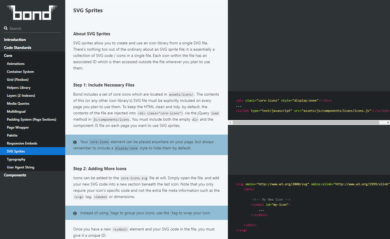
• Modern, symbol-based SVG icon system with full customization options via CSS.
• Perfect vertical rhythm with responsive font scaling variables.
• Complete documentation system built on Slate.
The Bond Process (Bonding)
The process of using Bond requires some basic knowledge of the command line, task runners and package managers. Essentially, users clone the base repository to their local machine and manually include or remove the components they need. These components are then customized as needed.
Design in Browser
My process first involves creating a basic design style guide including typography styles, image treatments, colours, and more in Adobe Photoshop or Adobe Illustrator. This creates the fundamental look, feel and mood of the entire project. Armed with these basic rules, I'm able to jump directly into the browser and start applying these styles to Bond components; designing in-browser. This completely eliminates the need of designing each page or interface statically and creates significant efficiencies across the project life cycle. As an added bonus, these static design patterns can also be applied to other materials such as print collateral and other marketing materials.
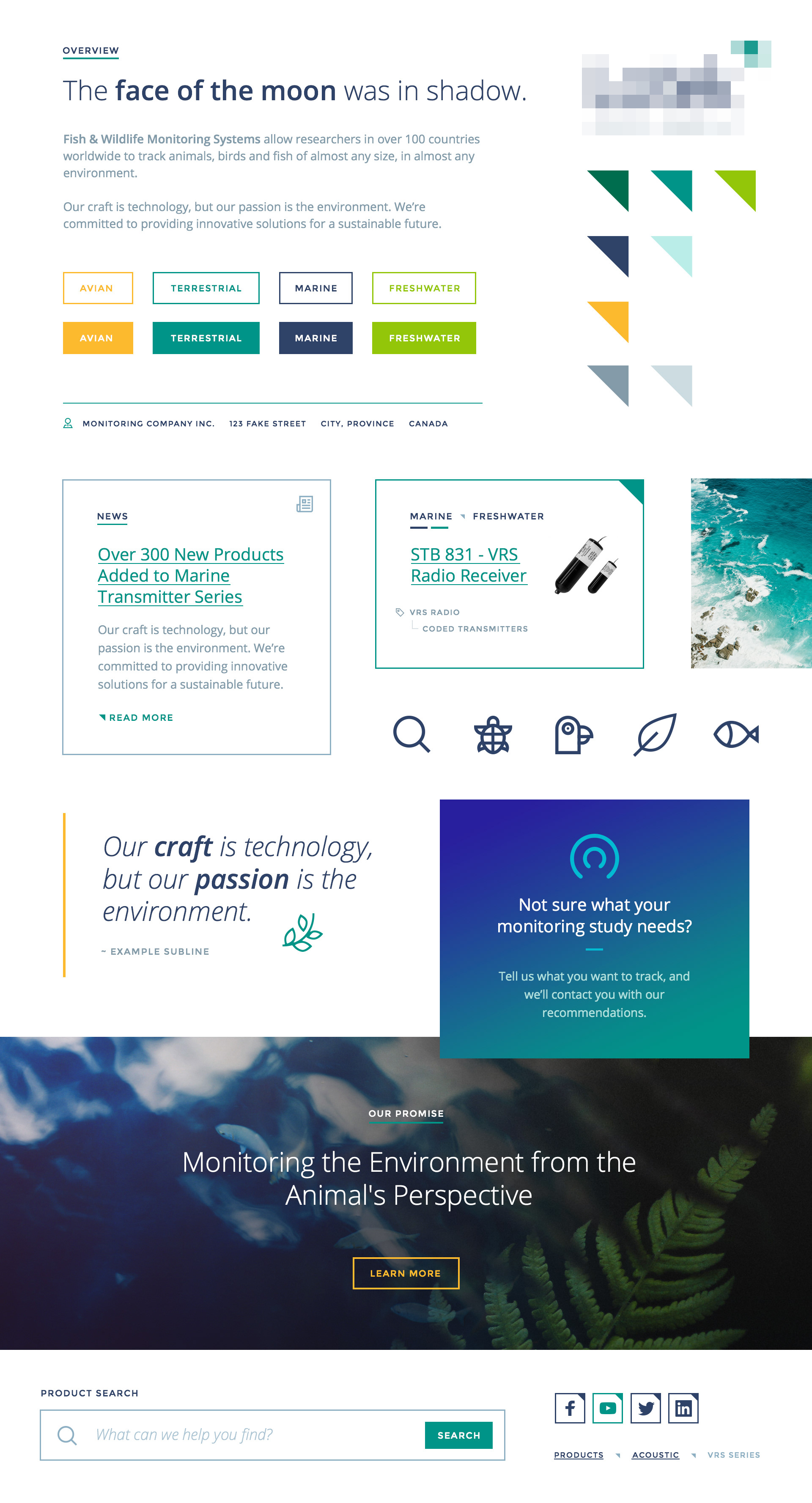
Static Style Guides and Mood Boards
Below is a prime example of a static style guide. It includes styles for the most fundamental components of the design and creates a cohesive at-a-glance view of the project's intended look and feel.
The Documentation
In order to ensure Bond was completely accessible to other developers I made it a point to build and write a full documentation system to go along with it.
Bond's documentation system was built using Slate and is fully searchable, features code blocks with syntax highlighting and more.
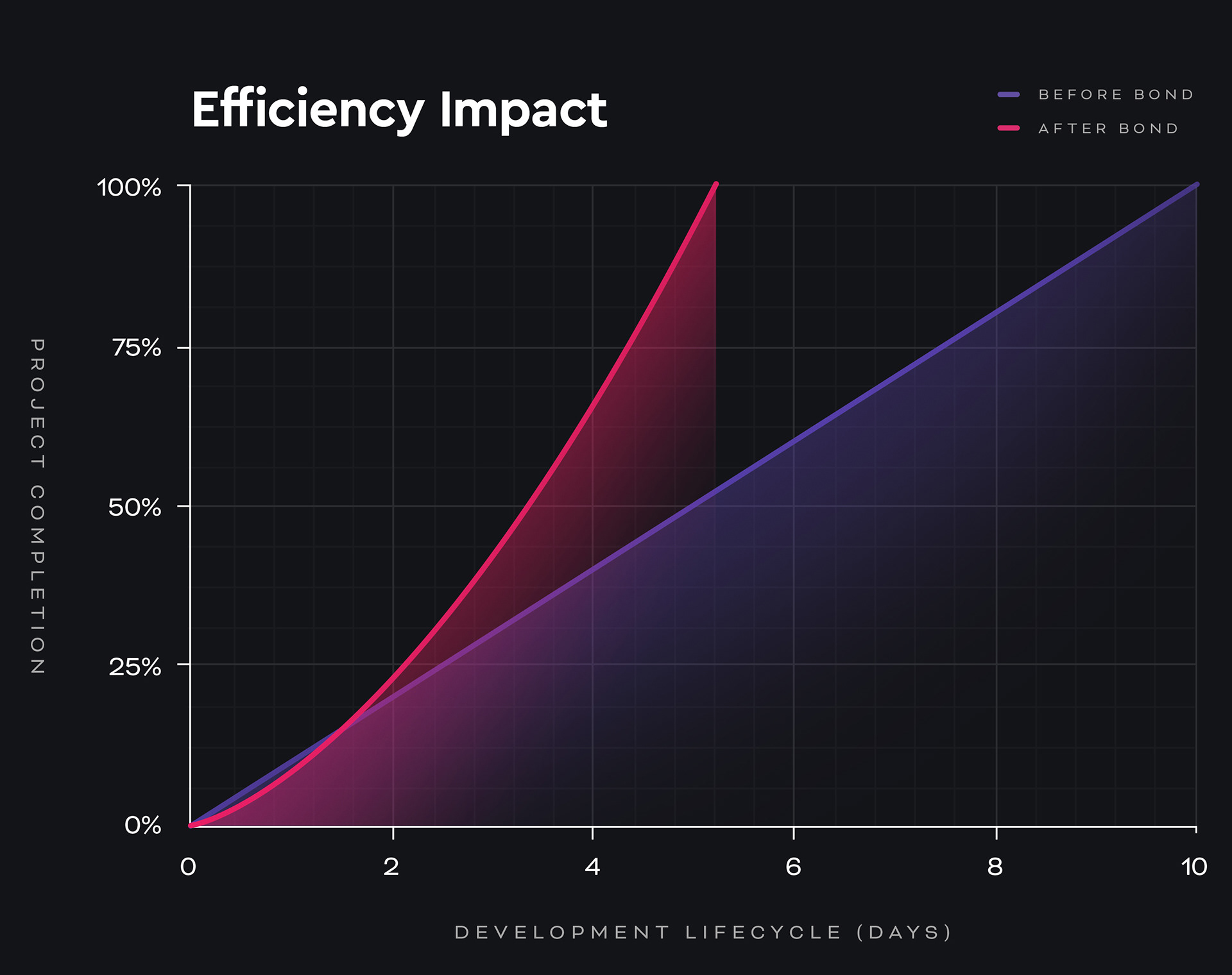
The Impact
Since Bond was introduced and applied to practical scenarios, front-end production cycles have been largely cut in half with implementations ranging from WordPress websites, static sites, web apps and even native mobile apps. Each time, the efficiencies that Bond created were marked despite the variation in platform and application.
The Future for Bond
I'm actively working on making Bond fully automated from the command line, enabling users to selectively choose which components and dependencies they require with simple commands. This will further increase efficiencies and bring Bond to the next plateau in front-end development.
Additional Credits and Thanks
Fellow front-end developer Josh Beveridge first introduced me to PostCSS with the development of his own framework, Clone. Although Bond was developed fresh from the ground up, the fundamental technology stack was inspired by Josh, subsequently laying the fundamental groundwork for Bond.