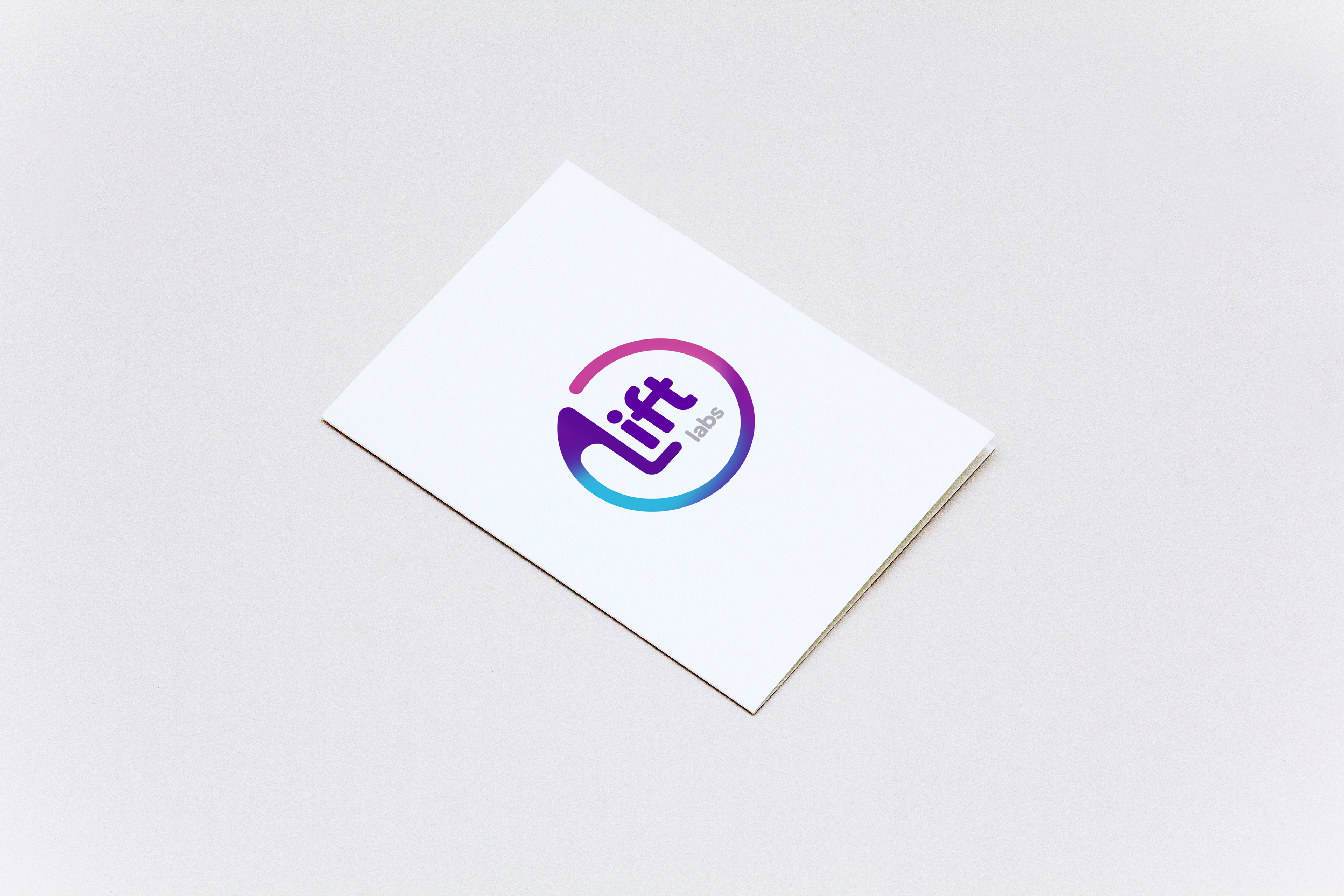

A logo concept developed for a local science lab. Lift Labs focuses on research into pediatric pain, so it was important for to keep this top of mind while navigating the logo design process. My primary goals were to be fun, light, approachable and colorful with the visuals. By aiming for an organic, non-geometric approach I was able to accomplish this. In addition, creating the circular shape around the logo itself communicates protection, comfort, and continuity. Using the “L” as a platform for the other letters further instills the idea of a positive, upward trend; a “lift.”