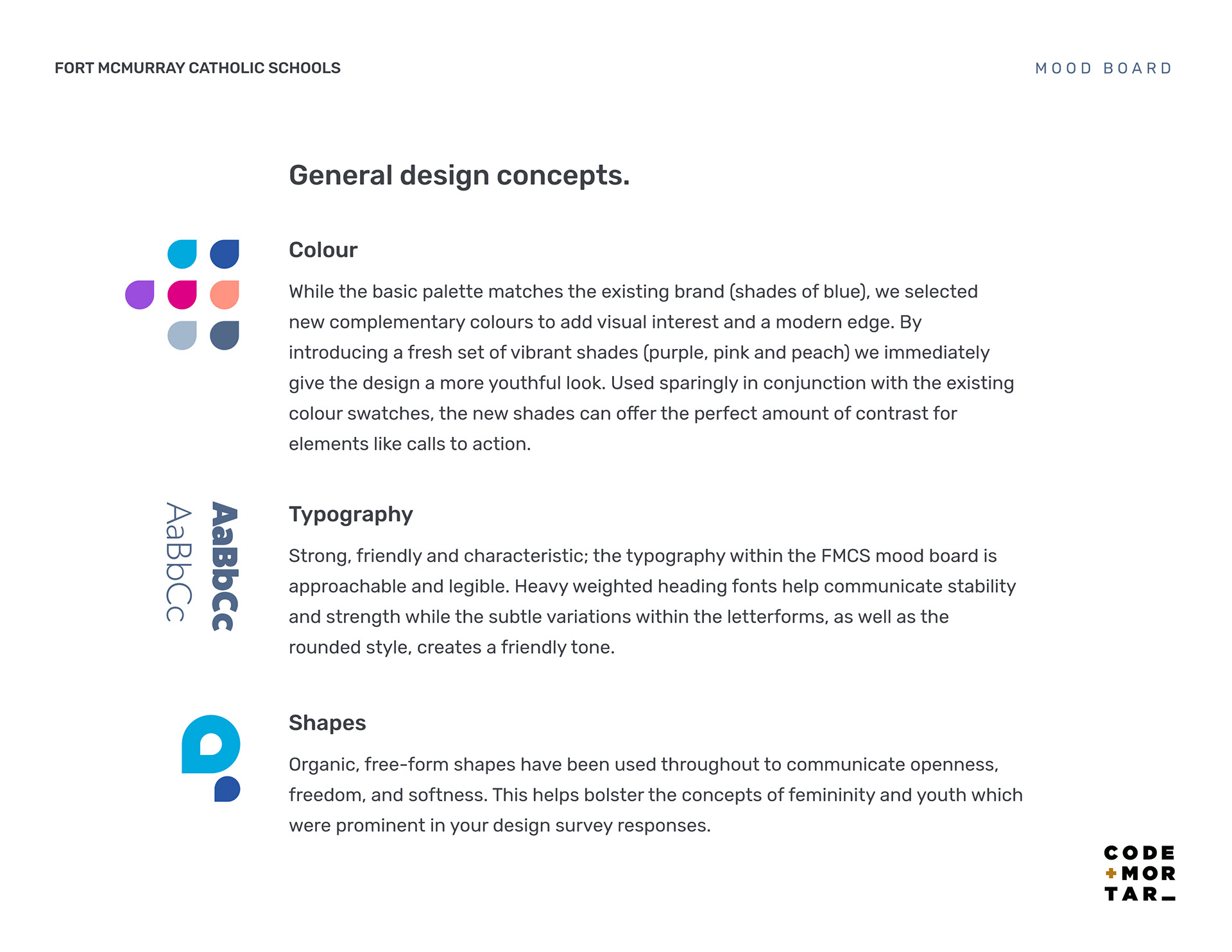
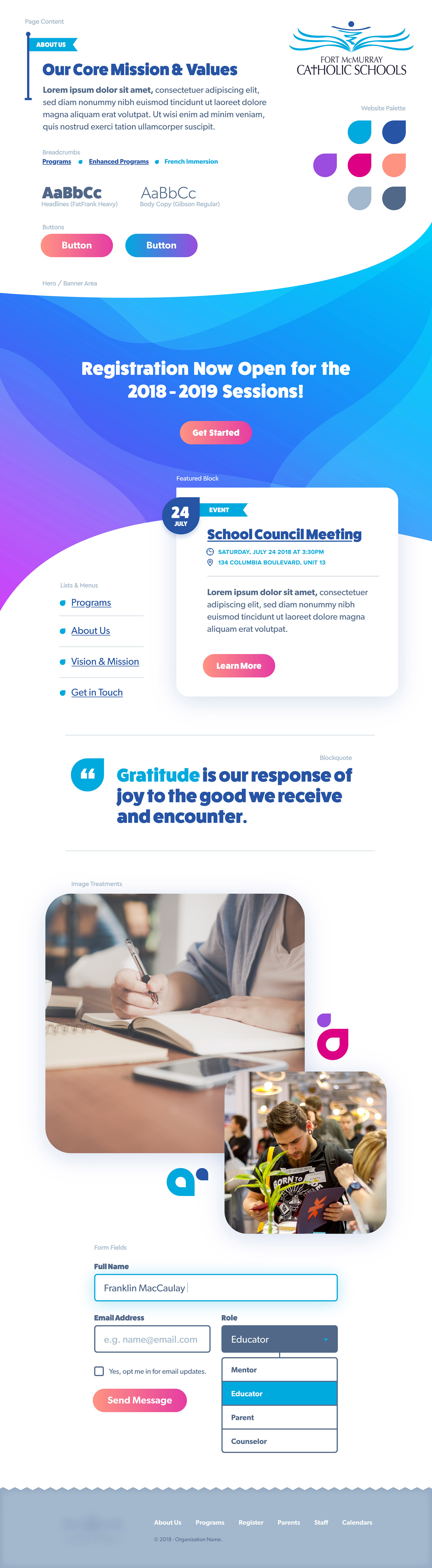
Colour
While the basic palette matches the existing brand (shades of blue), we selected new complementary colours to add visual interest and a modern edge. By introducing a fresh set of vibrant shades (purple, pink and peach) we immediately give the design a more youthful look. Used sparingly in conjunction with the existing colour swatches, the new shades can offer the perfect amount of contrast for elements like calls to action.
Typography
Strong, friendly and characteristic; the typography is approachable and legible. Heavy weighted heading fonts help communicate stability and strength while the subtle variations within the letterforms, as well as the rounded style, creates a friendly tone.
Shapes
Organic, free-form shapes have been used throughout to communicate openness, freedom, and softness. This helps bolster the concepts of femininity and youth which were prominent in the design survey responses we received.