Custom Timeline
Sonoro Gold wanted to tell the story of their journey to gold production, but a simple, static PDF wouldn't effectively inspire or communicate this excitement to potential investors. They needed something more engaging.
Suggesting an interactive "one-pager" as the frame, I quickly got to work adapting Sonoro Gold's existing historical content into a custom-built interactive timeline. By using the visual language I had already created in the website advertising as a guide, I was able to build an end product that was cohesive with their latest messaging and styling.
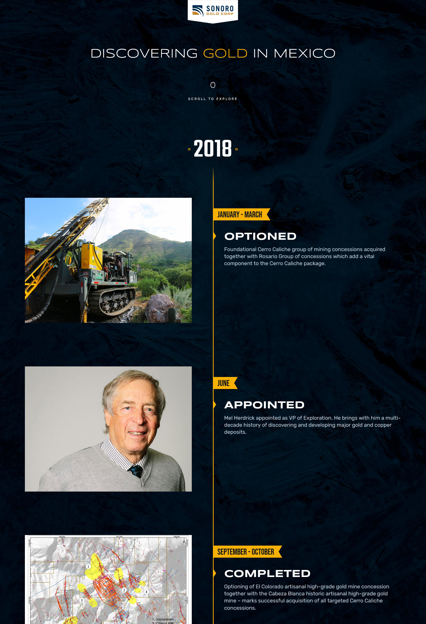
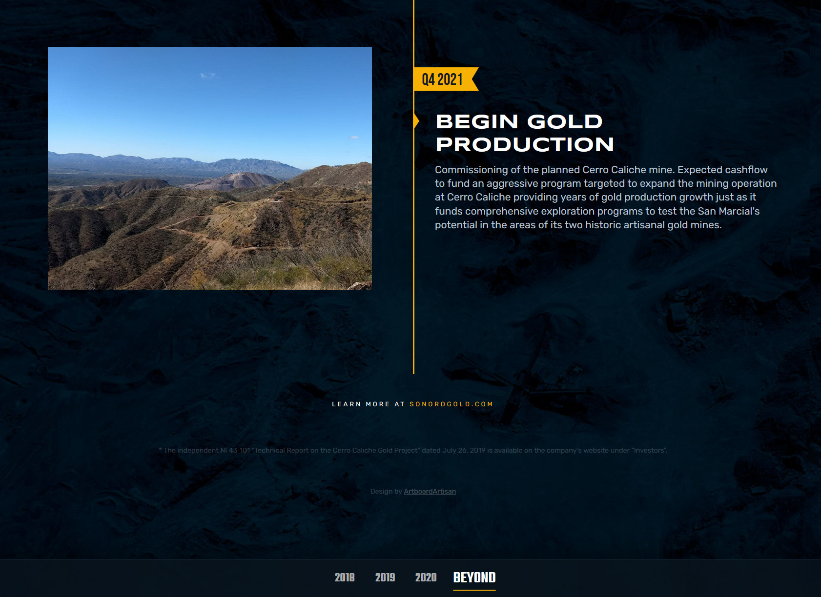
Custom Imagery
No stock photos here. All of the imagery used in the timeline comes directly from the source. In addition, image treatments like the 3D report below were incorporated to further elevate that custom feel.
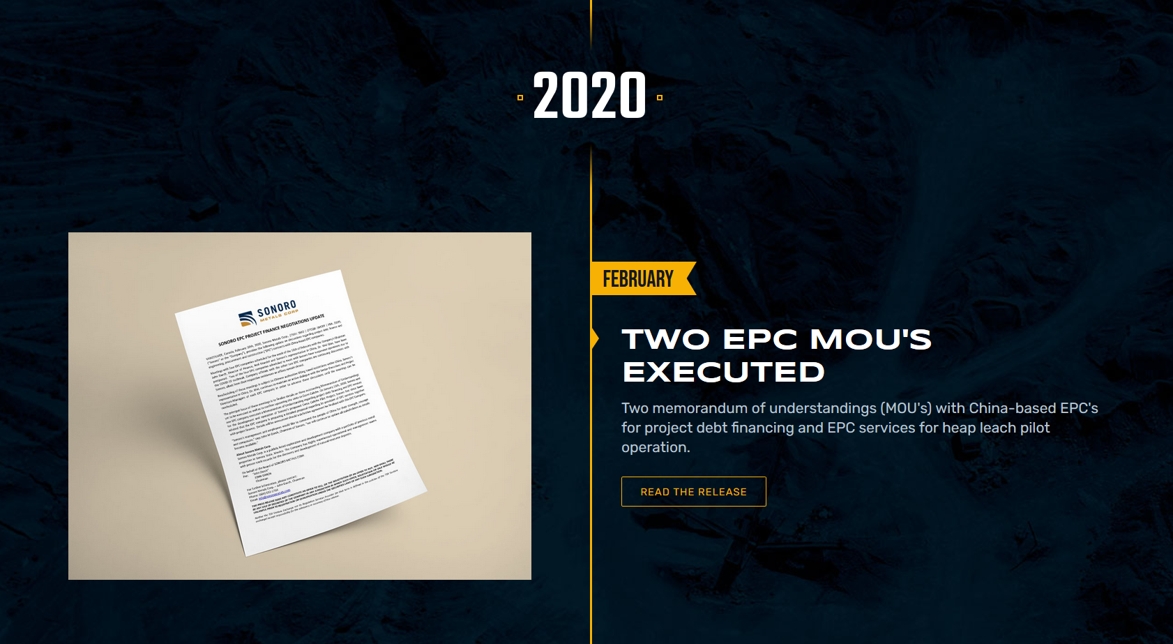
A Leading Line
The long, gold line traveling through the center of the timeline isn't just to lead you through the story - it also acts as a visual metaphor - representing a gold vein - with the date flags signifying "gold targets" through each event. When you reach the end of the timeline, the line finally leads you towards the Sonoro Gold website, where more investor-focused information is available.
Fully Responsive and Performant
Check out the live site at https://sonorogold.com/timeline
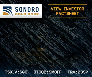
Website Advertising
A set of two website advertisements were needed for Sonoro Gold's marketing campaign. Focusing heavily on the "gold production" messaging, realistic textures and treatments were used to help set the stage.
The dark rock background allowed the gold texturing to stand out more clearly and draw the eye. Additionally, the way in which the word GOLD comes into view creates a sense of discovery - as if you were revealing gold from within the rock.
Crucial elements such as the brand and stock symbols do not animate and are purposely always visible to prevent disorienting viewers. The typography was also carefully tested for optimal legibility at smaller sizes.
Both design and animation were completed solely in Adobe Photoshop, with additional image optimization treatments to remain within spec.