The Challenge.
My client in this case was seeking a new way to display and manage large sets of data to a number of users who are mostly unfamiliar with using web applications. Ultimately, I was tasked with providing a highly usable, reliable and visually engaging product architecture. This essentially came down to ensuring a high adoption rate and a quick and easy onboarding process for users, with minimal learning curve.
The Design Approach.
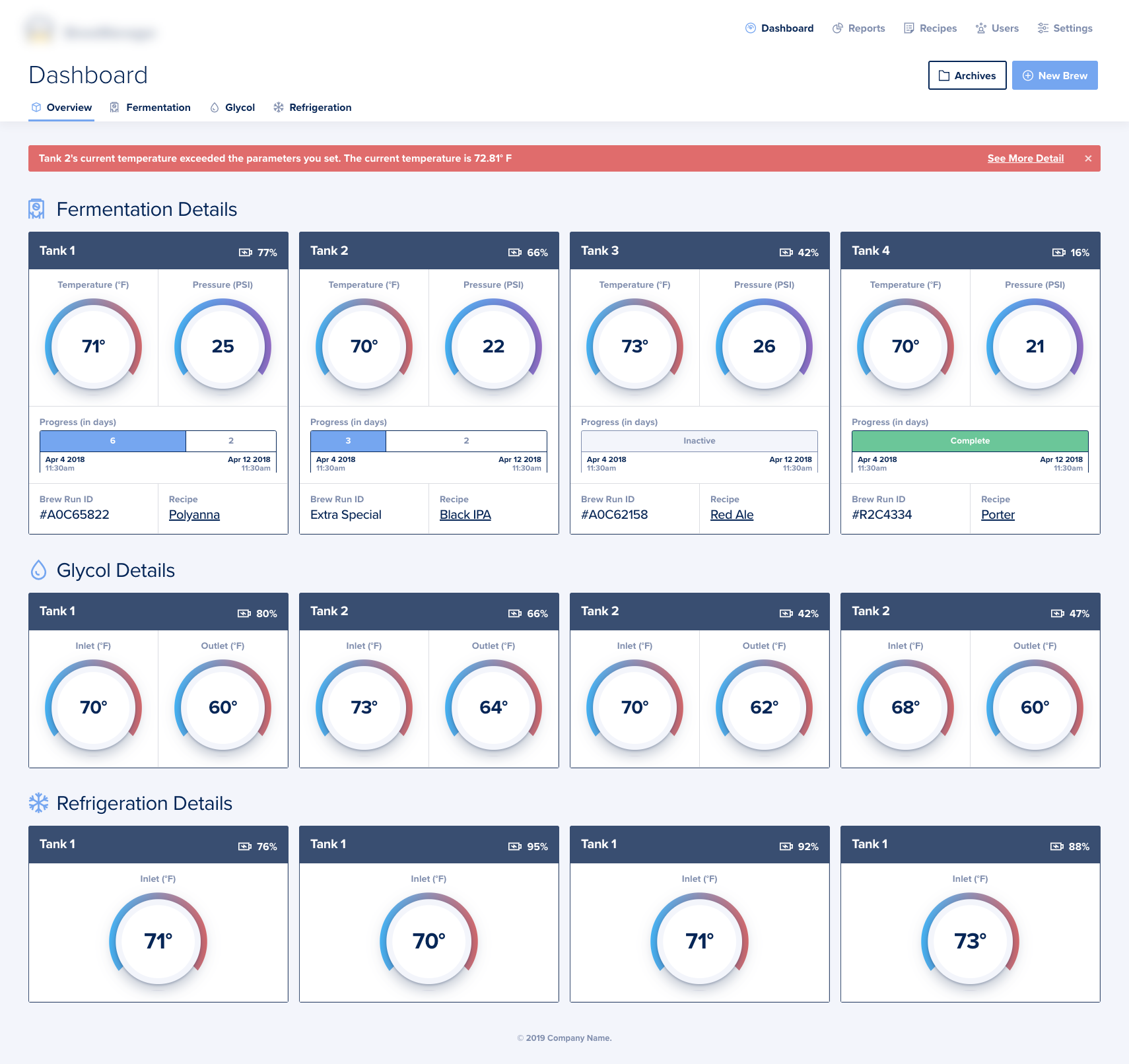
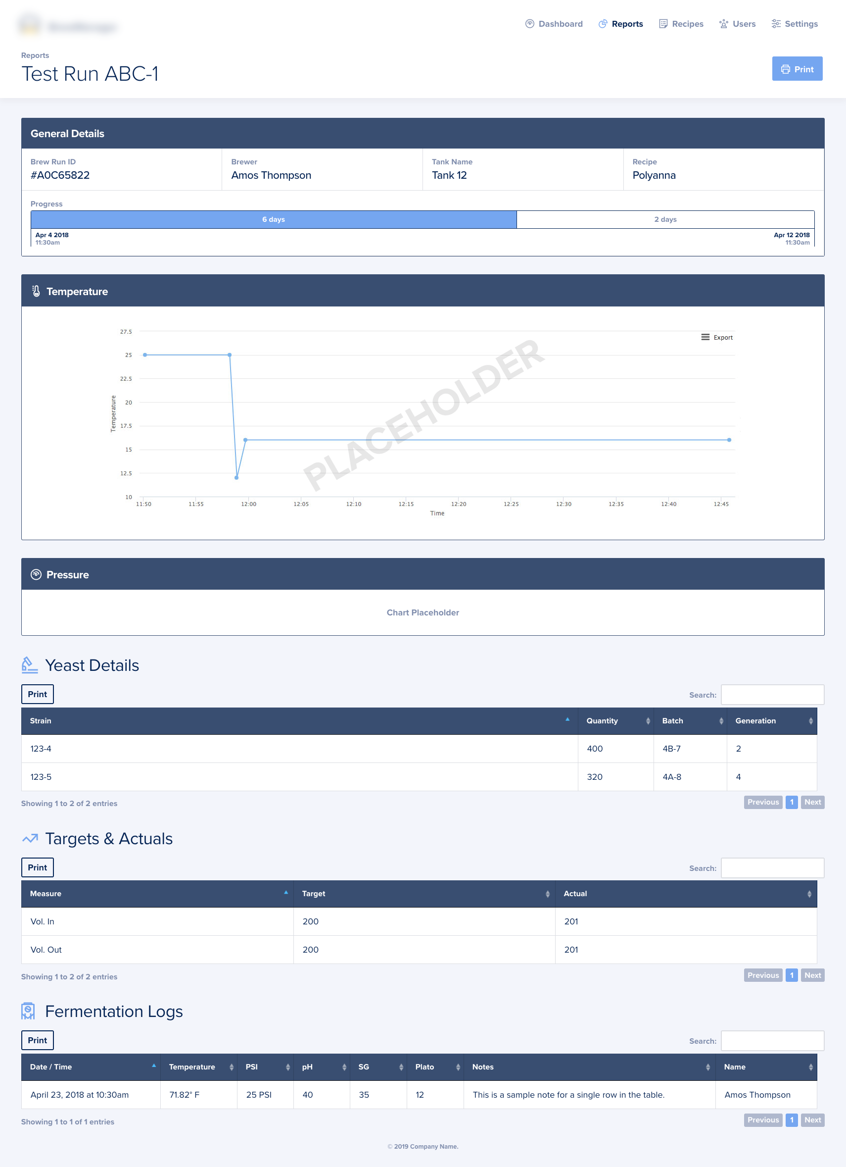
The ability for a user to effectively manage and monitor large sets of data through a web app relies on proper visual hierarchy. This project was no exception. From the Dashboard, users can see the full status of each individual brewing tank including data points such as temperature, pressure, level of completion, recipe names, and more represented in a familiar, visual way. Temperature and pressure data is reported via a collection of small sensors in each tank. This data then gets sent through to the web app for display.
I've developed some custom visuals here to represent these data points; with the aim being to emulate real-world objects such as thermostats and control knobs, creating a familiar visual language. All of the styling for these knobs was done entirely via CSS code - zero images were used in creating these elements.
I worked closely with our client in developing rapid prototypes directly in-browser. This allowed the client and their users to jump right in during design and development and provide feedback loops as we progressed. This type of agile methodology was key in making proper and informed decisions throughout the process.
Accounts.
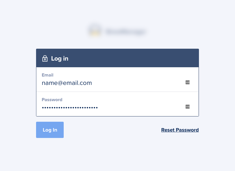
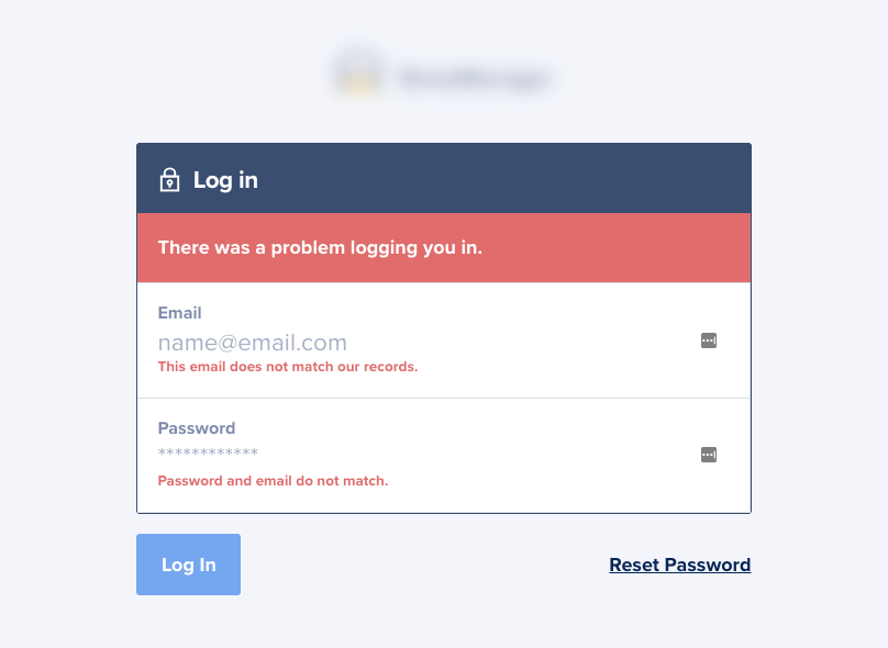
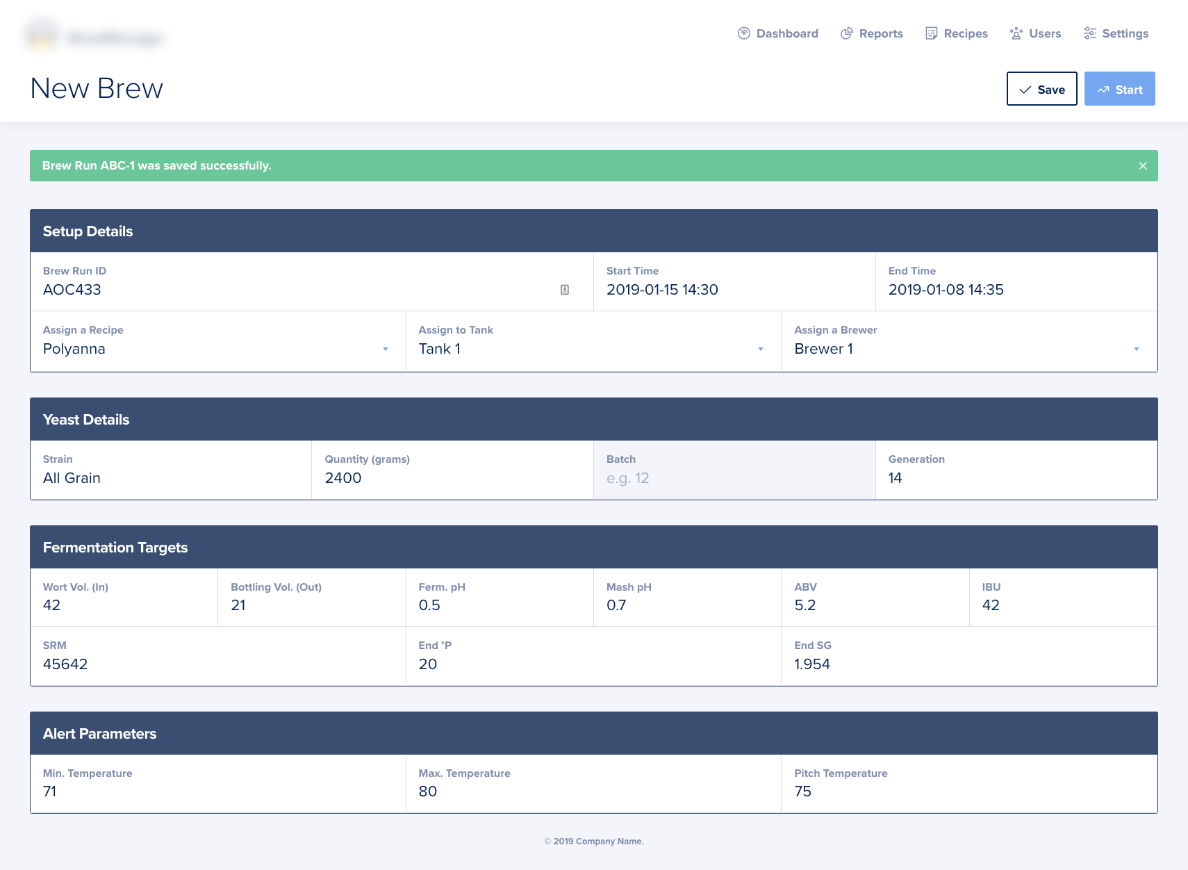
Every detail matters. Which is why I decided to create custom views for the account interfaces within the app. In this case, you can see a custom form designed to match the visuals of the overall project. In addition, custom form validation styling was applied to ensure a polished end result.
Data Management.
Within the brewery software, users can manage multiple different types of data including recipes, reports, users, and more. We needed a consistent and user-friendly way to display these fields.
Each field group is separated by a large, bold header identifying the purpose of the section. Each field is then carefully laid out within the containing block. Labels for each field input are kept in place at all times, ensuring an accessible experience. Once a user focuses on a specific field, it "glows" bright blue indicating the active state.
This modular, block-style layout remains accessible and usable on multiple different devices such as desktops, laptops, tablets and even mobile phones due to its simplicity.
Reports.
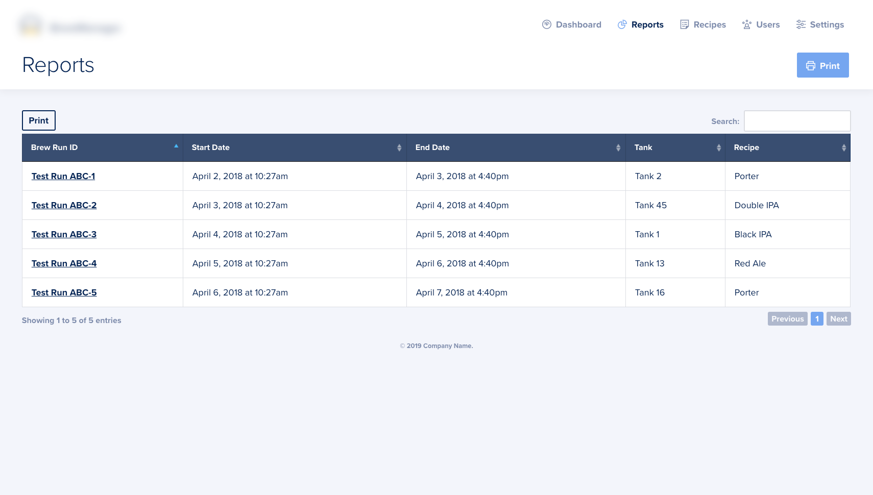
Breweries need to understand and consume data points over many different variables. We used the DataTables plug-in for these tabular views; the features of which are robust and plentiful.
For this project, we specifically took advantage of the DataTables in-context search feature, as well as the pagination, sorting, and print functionality.
Details Matter.
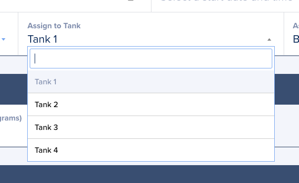
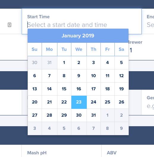
Creating a usable product means being considerate of every aspect of every workflow. For example, we've included custom-styled date and time picker functionality within relevant data input sections. We've also included a handy searchable dropdown feature for selectable inputs.
Workflow helpers such as these assist in future-proofing a digital product, as it allows for the consumption and perusal of large data sets and data points as they grow over time.