The Design Approach
After moving through a strategic questionnaire and survey process with key CFI stakeholders, I was able to distill their information and requirements into three primary pillars:
1) Excitement: Through smart use of colour, imagery, and typography.
2) Engagement: Through subtle but surprising animations and user interaction.
3) Perception: Through key messaging and carefully considered groupings of content.
I decided to traverse a bit outside of the box and "different" which is really what CFI were seeking. Matching up with their target emotions gathered during our questionnaires, I went for a colourful, youthful, and feminine visual language. Adding some subtle depth and shadowing really helps support the tasteful animations and overall dimension of the experience.
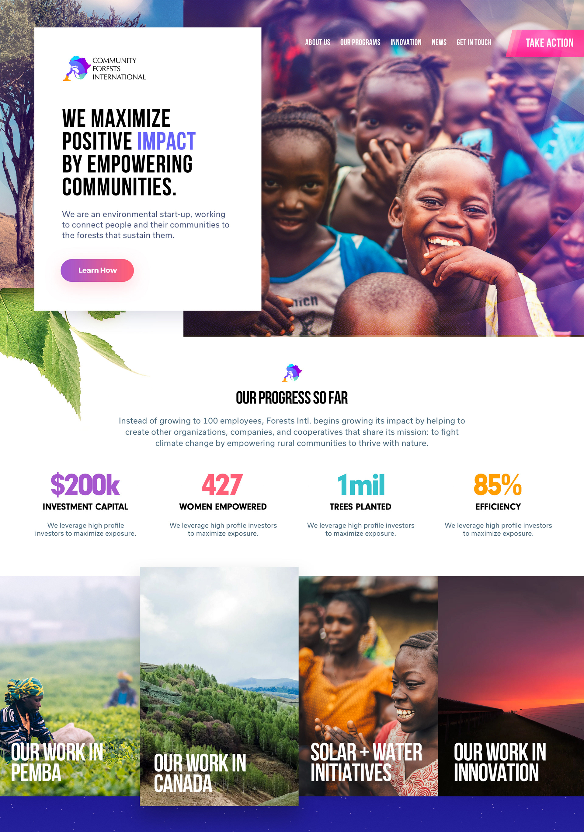
Custom CSS Animations and User Experience
To further incite engagement into the CFI initiative, I've included some custom hand-built CSS animations in many different areas of the site. It was important to ensure these animations provided a delicate balance between interesting and overwhelming. The inspiration for such an approach came from a primary client directive - "...eye catching with a surprise or two...".
Below you can see two primary things happening:
1) All statistics gracefully animate in with a slight offset in each number.
2) A grouping of leaves blooms from behind the newsletter signup.