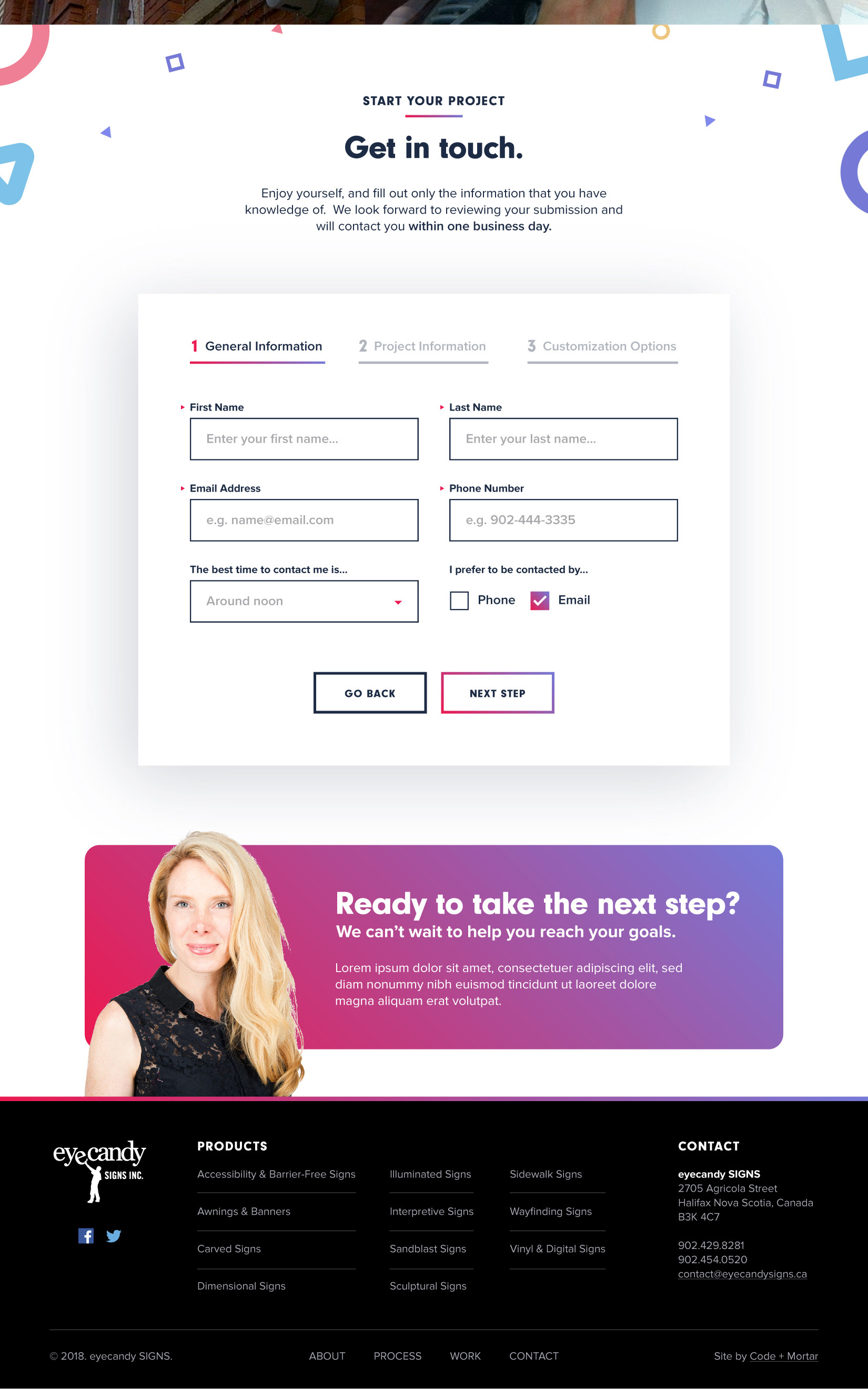
Primary Colours
Strong, bold, vivid yet reserved. The eyecandy web palette commands attention and provides a vibrant splash of colour to separate it from the varying tones in the signage photography. Perfect for calls to action and key messaging, the red and purple tones invigorate users and spawn activity. Subtle gradients have also been introduced to further create depth and visual interest.
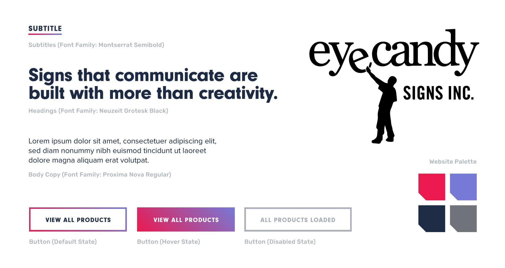
Typography
Strong, friendly and characteristic; the typography within the eyecandy mood board is approachable and legible. Heavy weighted heading fonts help communicate stability and strength while the subtle variations within the letterforms, as well as the rounded style, creates a friendly but refined tone.
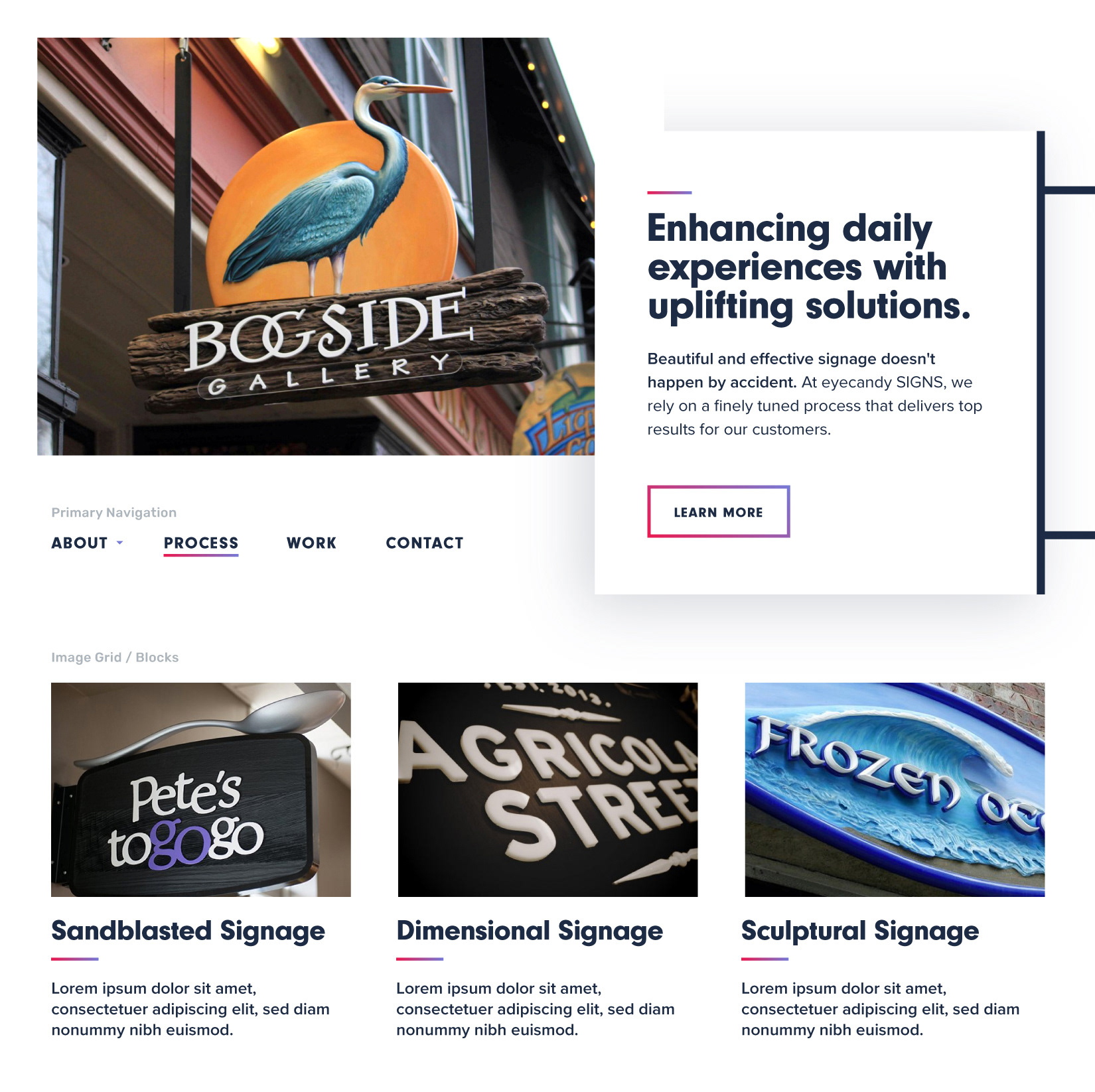
Shapes
Designed to help communicate the diversity, creativity and passion behind eyecandy’s body of work, a collection of primary shapes offsets the otherwise minimal and subdued atmosphere of the design; creating a subtle but fun and unpredictable edge.