The Centre for Pediatric Pain focuses primarily on researching and applying solutions to chronic pain in children. Understanding the website should appeal to both parents and children, we needed to find a balance between the two. Simplistic, but not rudimentary; approachable, but not overtly "childish." This balance in visual language was struck by introducing familiar, soft colors and delicate elements throughout. The pink and purple hues help exemplify femininity and create a motherly tone. Soft, subtle gradients act to bolster this effect while elements such as clouds and hot air balloons are used to help visitors feel comfortable and at ease.
2017
Website Redesign and Development
— M O R E P R O J E C T S —
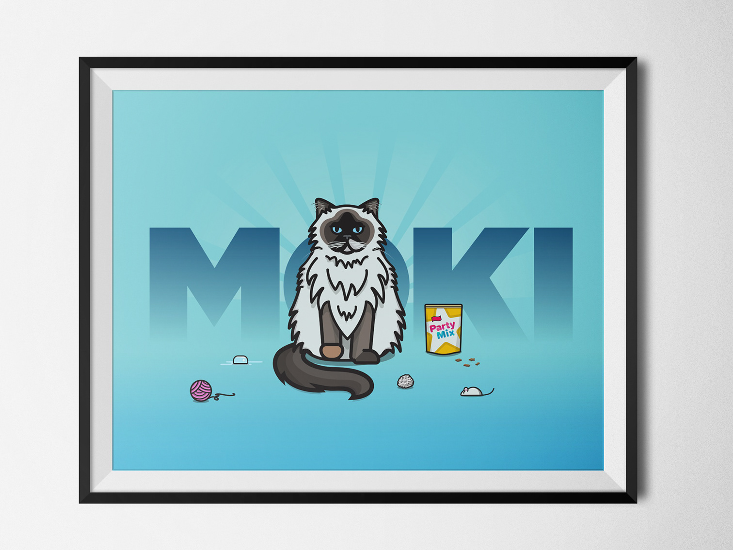
Moki the Cat
Digital Illustration

Atlantic Stormwater
Website Redesign and Development
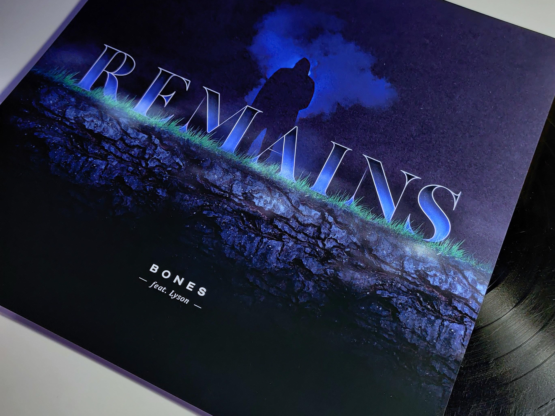
REMAINS
Album Artwork

Trek
Travel Planner

EDM Ltd.
Branding, Website Redesign and Development

Fourth Avenue
Website Design & Branding
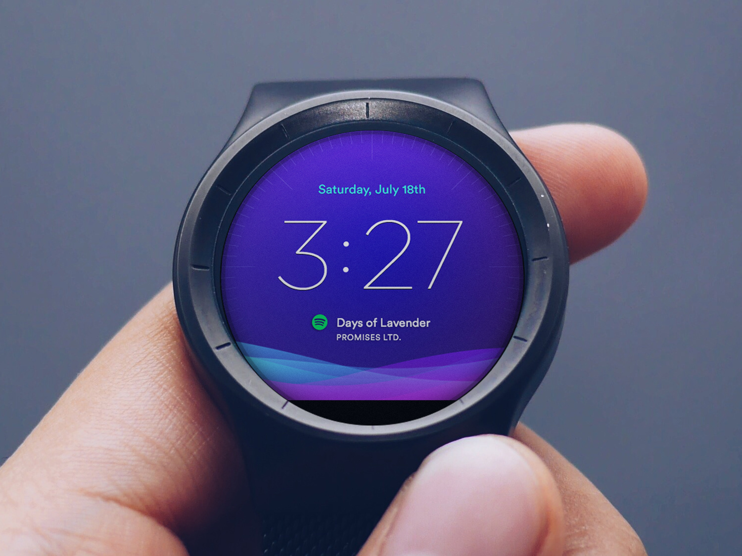
Moto 360 Watch Face
Wearable Interface Design

Personal Identity
Branding and Logo Design
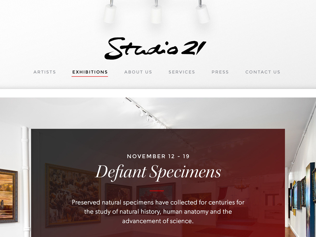
Studio 21 Fine Art
Website Redesign and Development
FlowPharma
Website Redesign
