The Design & Layout
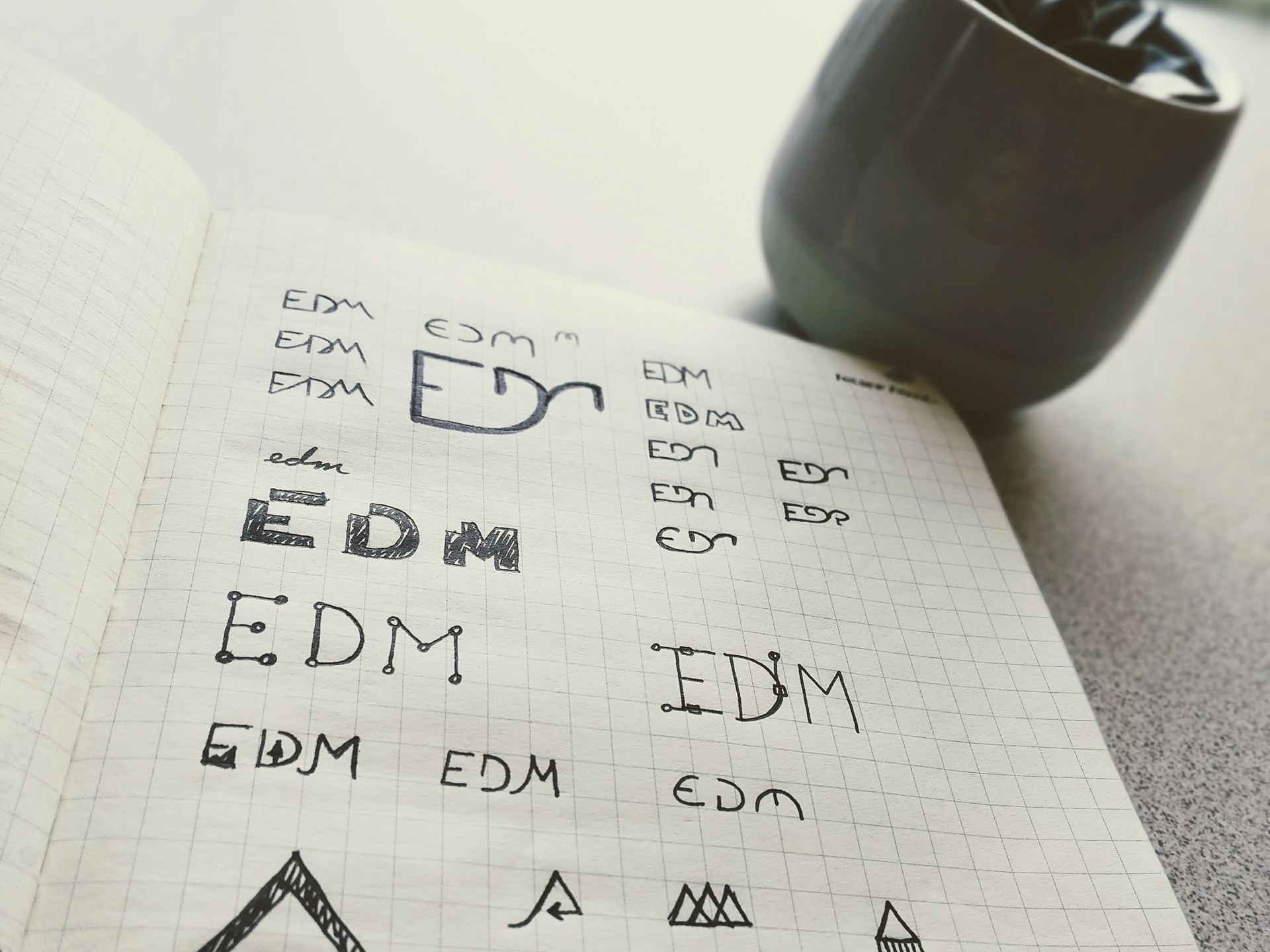
Crafted by hand starting with pencil and paper, Trek comes from humble beginnings. Even though it's a mock project, I wanted to make it look and feel functional and as real as possible. This was accomplished by first setting out a list of "features" to include such as filtering, search, tags, and more. Combining these features really transformed this idea into something that could very well exist in the wilds of the web.
Background Video with CSS Masking
In order to spawn inspiration and motivation, engaging video was included in the form of an animated video banner. The challenge here was utilizing modern CSS masking techniques to knock out the logo element showing the video beneath. This offers just enough of a "window" into the subject matter within.
The Excursions
Clicking on an excursion in the table above displays a custom modal window with all pertinent details relating to that trip. Relevant data from an accompanying JSON file gets fed into the modal each time an option is clicked. While traversing the modal, several features make it come alive including toggleable climate information, data-bound registration forms and "magic" itinerary. As you progress through the form, your itinerary is automatically updated based on your answers.
Excursion Data
Climate and weather data is shown in both Imperial and Metric formats for each location.
More Trips
All data, including the banner image, within the modal is updated on the fly per selection.
Health Alerts
Since some wilderness excursions require tremendous physical effort, it's important to ensure that participants are healthy and capable. If you select "Yes" in the following question, a health alert is displayed automatically as a warning.
